The Netflix app just updated on our TVs… new UI is the absolute worst! Endless scrolling to find things, thumbnails take up half the screen, and the icing on the cake: once you’ve scrolled down a bit, you need to scroll aaall the way back up to the very top to find search etc.
News 16/08/2025 09:57
Netflix faces backlash after rolling out 'horrible' redesign that viewers 'hate'
If it's not broken, don't fix it
Netflix faces backlash after rolling out 'its controversial app design that leaves viewers unhappy.
The streaming giant first revealed the new interface and began rolling it out globally on the app on 19 May.
Netflix promised the update would deliver 'better recommendations and an improved interface that highlights what matters most to you.'
But many found it clunky and hard to use, with some even threatening to cancel their subscription.
Now, the design has come into force on Apple TVs in the latest 3.0 version of Netflix and completes a months-long rollout that began with other TV platforms earlier this year.
Perhaps the most noticeable change is that the left-hand sidebar navigation that Netflix has used since 2018 has been replaced with a top menu bar.
The new top bar relocates key functions including Search, Home, Shows, Movies, Games, and My Netflix. Additionally, the My List and My Netflix sections have been merged in an attempt to streamline access to personal content.
When browsing content, the familiar static tiles for shows and movies have been replaced with expandable tiles. When a user hovers over a tile, the enlarged, expandable preview plays a trailer of the selected movie or TV show.
Netflix says the redesign focuses heavily on improved recommendations, promising more relevant and personalised content suggestions based on viewing history, as reported by MacRumors. The platform claims these recommendations will be more responsive to users' 'moods and interests in the moment.'
The update also introduces contextual labels like 'Recent addition' and 'No. 3 in movies' to help explain why specific content appears in recommendations.
Since the r/apple thread posted about the update, Reddit has been flooded with frustrated subscribers venting about the changes.
"I despise movie tiles that expand when you land on them. Worst design ever. Can't wait for yet another streaming service to annoy me in that way. Static tiles are way better," one user wrote.
"Nothing annoys me more than a top bar menu. Side bar is superior in every single way for navigation, and I have no idea why these streaming platforms keep changing to a top bar menu," added another Reddit comment.
"Aaaaannnnnd it’s horrible. Nice," someone else bluntly replied.
Some users have noted that Amazon Prime Video implemented similar changes, which have also been poorly received.
Adding to the frustration, other users suspect that the redesign might be a precursor to monthly price hikes, which has concerned the community.
The latest version 3.0 of the Netflix app on Apple TV requires tvOS 17 or later. Some users may need to manually update the app through the App Store to access the new interface, as the update may not appear automatically for everyone.
News in the same category

Homeless man who won $1,000,000 on lottery ticket met with incredible act of kindness from store manager he bought it from
News 16/08/2025 12:04

FDA issues urgent blueberry recall over fears they ‘could cause death’ following tests
News 16/08/2025 11:54

Important details of Jesus' life discovered in incredible 2,000-year-old boat
News 16/08/2025 11:37

Why family of 'Sleeping Prince' refused doctors' advice as he dies after spending 20 years in coma following car crash
News 16/08/2025 11:36

Woman who made $80,000 in seven months while selling her toenails reveals disgusting thing they're used for
News 16/08/2025 11:35

Citizens fear Alaskan capital could be swallowed under water following major glacier outburst

Cryonic preservation: 50 years later

Important Signs To Look For That Could Suggest You Have Polymyalgia Rheumatica

Popular shampoo recalled over deadly bacteria risk

Hugging and cuddling kills depression, relieves anxiety, and even strengthens the immune system — here’s why you should do it more often!

Donald Trump brutally called out by his own AI chatbot in embarrassing posts

Scientists discover mind-blowing 'proof' of ancient civilization living in Louisiana 13,000 years ago

People finally track down real-life location of viral truck stop that's impossible to visit

Trump slams Nobel Prize-winning economist as ‘deranged bum’ after brutal takedown of his tariff plan

Trump fires back with blunt 6-word statement after Epstein photos resurface

Ancient Warning Emerges On Hawaiian Shore Days Before Massive Earthquake

Bizarre reason ChatGPT will always refuse this one simple request

Elvis Presley’s Private Flight From 1962 Has Finally Been Sold – The Interior Is Amazing

Why McDonald’s Removed The Clown From The Company Image
News Post

Arkansas woman accidentally discovers $27,000 dollars after kicking 'spiderweb' in park
Facts 17/08/2025 00:31

The Nightly Power of Garlic: 9 Incredible Benefits and How to Use It
Health 16/08/2025 23:22

An Onion Drink for Eye Health: A Holistic Approach
Health 16/08/2025 23:10

A Pill to Regrow Your Teeth? The Future of Dentistry is Here
Health 16/08/2025 22:54
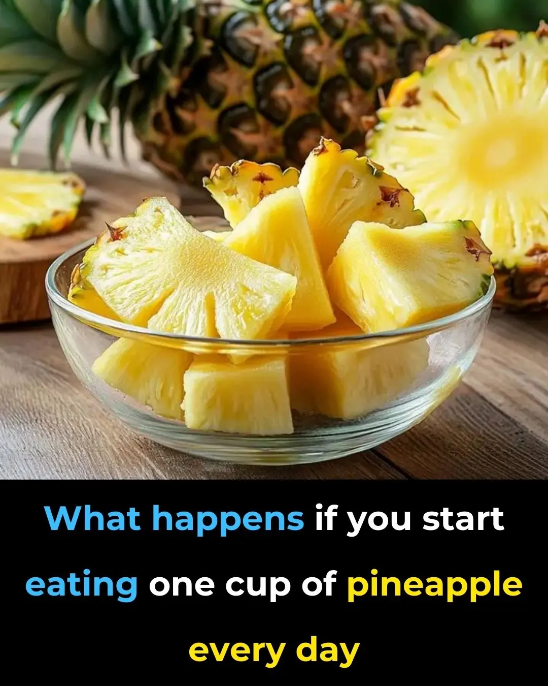
6 Health Benefits of Eating One Cup of Pineapple Every Day
Health 16/08/2025 22:13
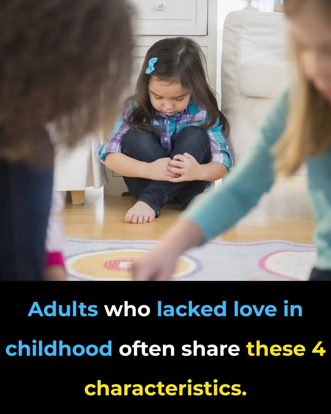
4 Common Traits of Adults Who Grew Up Without Love
Facts 16/08/2025 22:11

82-Year-Old Woman Reverses Dementia Symptoms with Mediterranean Diet
Health 16/08/2025 21:43

The Real Consequences of Sleeping With…
Health 16/08/2025 21:40

Tibremciclib for Advanced Breast Cancer: Is It Worth It?
Health 16/08/2025 20:40

Pluvicto vs ARPI in Prostate Cancer: Is One Better?
Health 16/08/2025 20:40

Does Chest Pain Always Mean a Heart Attack?
Health 16/08/2025 16:39

10 Tasty Snacks Packed With Good-for-You Carbs
Health 16/08/2025 16:35

Pokeweed: The Attractive but Highly Toxic Plant Growing in Your Backyard
Beatuty Tips 16/08/2025 16:25

Goosegrass: Health Benefits and Uses
Beatuty Tips 16/08/2025 16:20

The Powerful Health Benefits of Lipton, Cloves, and Ginger Tea Every Woman Should Know
Beatuty Tips 16/08/2025 16:18

Drink this before bed to balance blood sugar & stop nighttime bathroom trips!
Health 16/08/2025 16:18

This vegetable oil linked to “aggressive” tumour growth, study finds
Health 16/08/2025 16:16

The Miracle Tree: 16 Health Benefits of Moringa & How to Use It
Beatuty Tips 16/08/2025 16:15
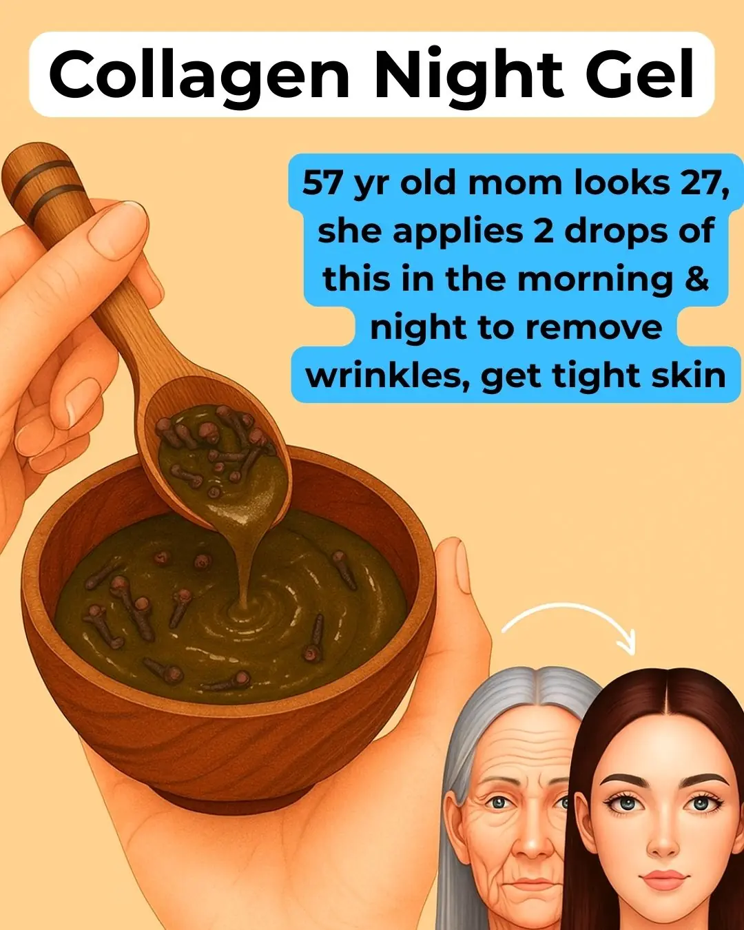
Clove Collagen Gel : Night Gel For A Smooth & Tight Skin
Beatuty Tips 16/08/2025 16:12
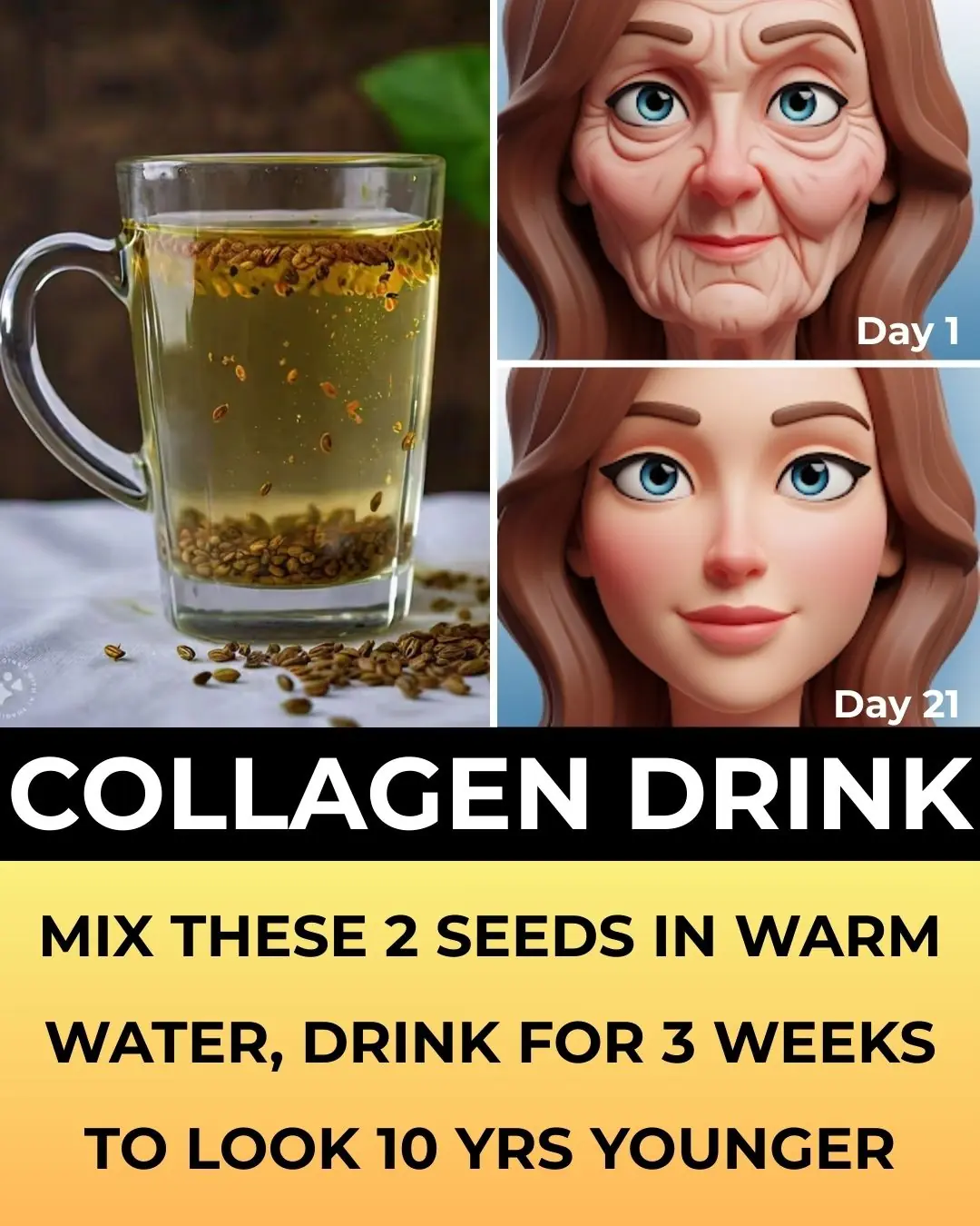
Transform your skin with fenugreek seeds
Beatuty Tips 16/08/2025 16:08